Timeline
October 2022 - Present
October 2022 - Present
UX Researcher, UX Designer, & Front-End Developer
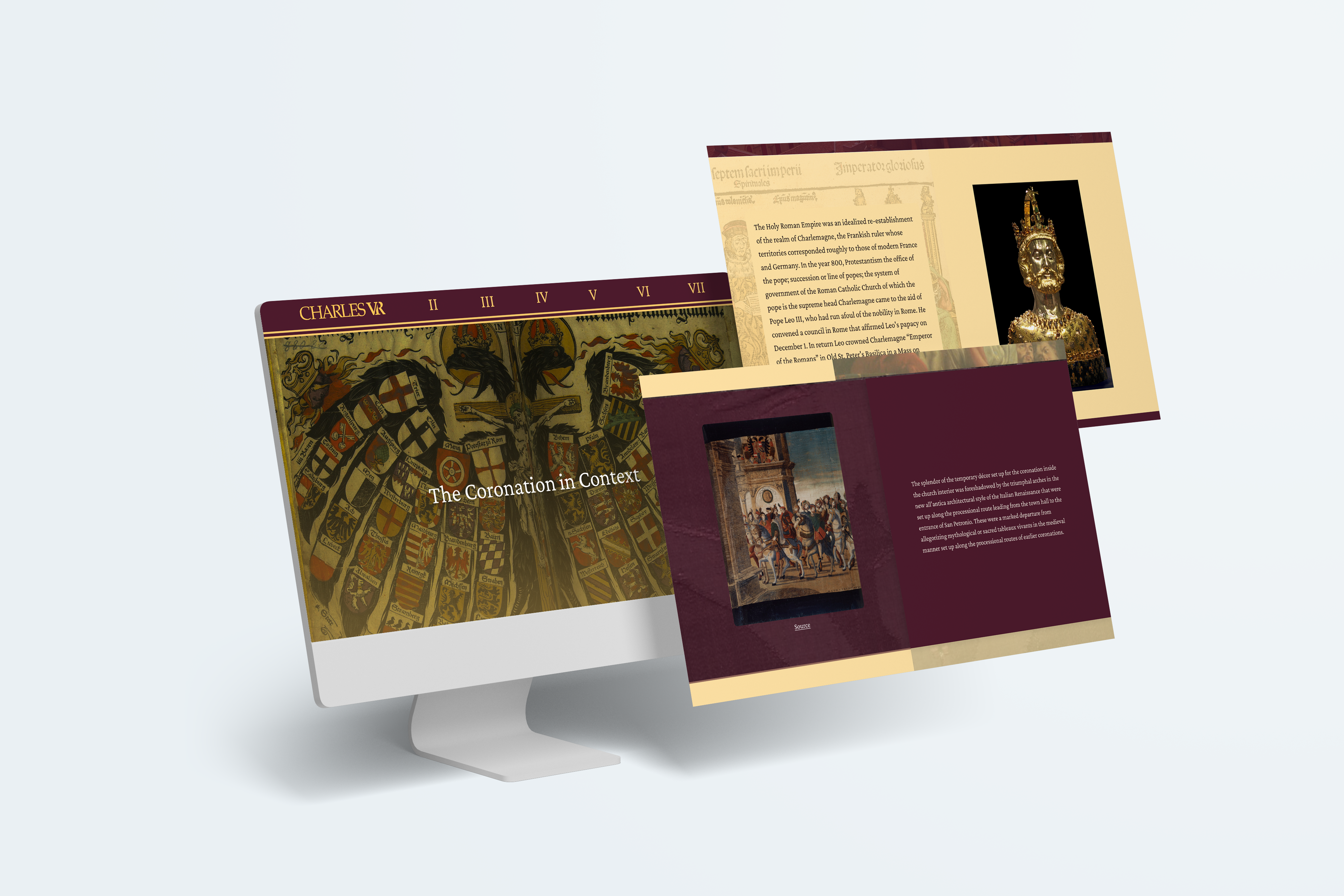
Charles V|R is a virtual reality recreation of the coronation of Charles V. The app is supposed to be a tool to teach students about the coronation in an immersive environment. The website gives context to the coronation as well as the virtual reality experience itself
This website already existed when I joined the project. The website had been dormant for a while and needed to receive a makeover before it was officially published. I joined the project as the lead UX/UI designer and the lead Front-End Developer using the svelte Javascript framework. This was the first time I had ever used Svelte, so it was definitely a learning curve for me!
The website relies heavily on text boxes above the buttons to give context to the actions of the buttons. On my first scroll through I tried to click the text boxes and was confused when I wasn’t navigated to the next page
The demographic of the audience reading this website is students who will be going into the Charles V|R experience, so some of the vocabulary on the website may need to be defined for them
The website has very little color on it and the colors that are present are very muted, making the website feel very bland. Without these pops of color, the website doesn’t draw attention to the call to action such as the download buttons
The navigation bar is a prime example of the poor contrast on this website. Without this contrast, the readability of the website goes down significantly.
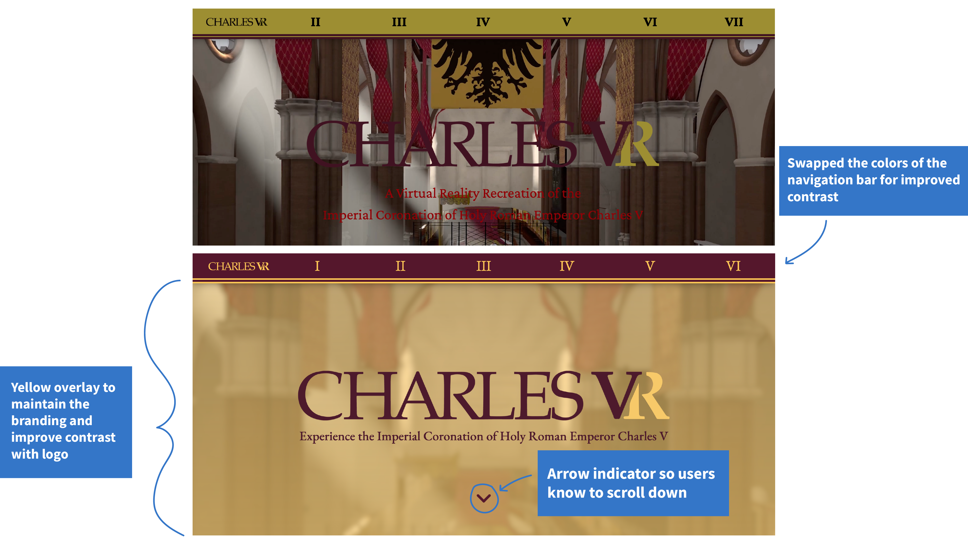
I wanted to move the website away from the black and white colors and introduce colors from the logo to add visual interest. I also implemented gradients over the backgrounds to tie together the new yellow-maroon color scheme
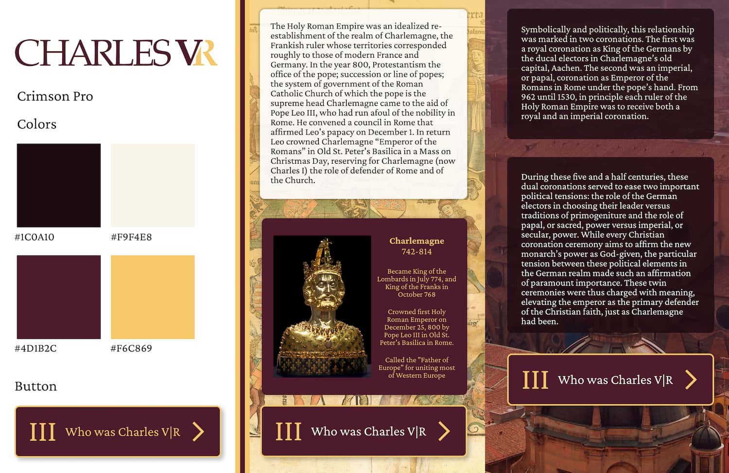
In this new style tile, I moved away from using Crimson Pro to opt for a more legible font being Garamond. I also shifted the color values to implement a very light cream which would be used in the color blocking schematic that provided a lot of legibility when paired with black text. The color blocking was done to mimic the colors in the logo, and how it switches from maroon text to gold text.

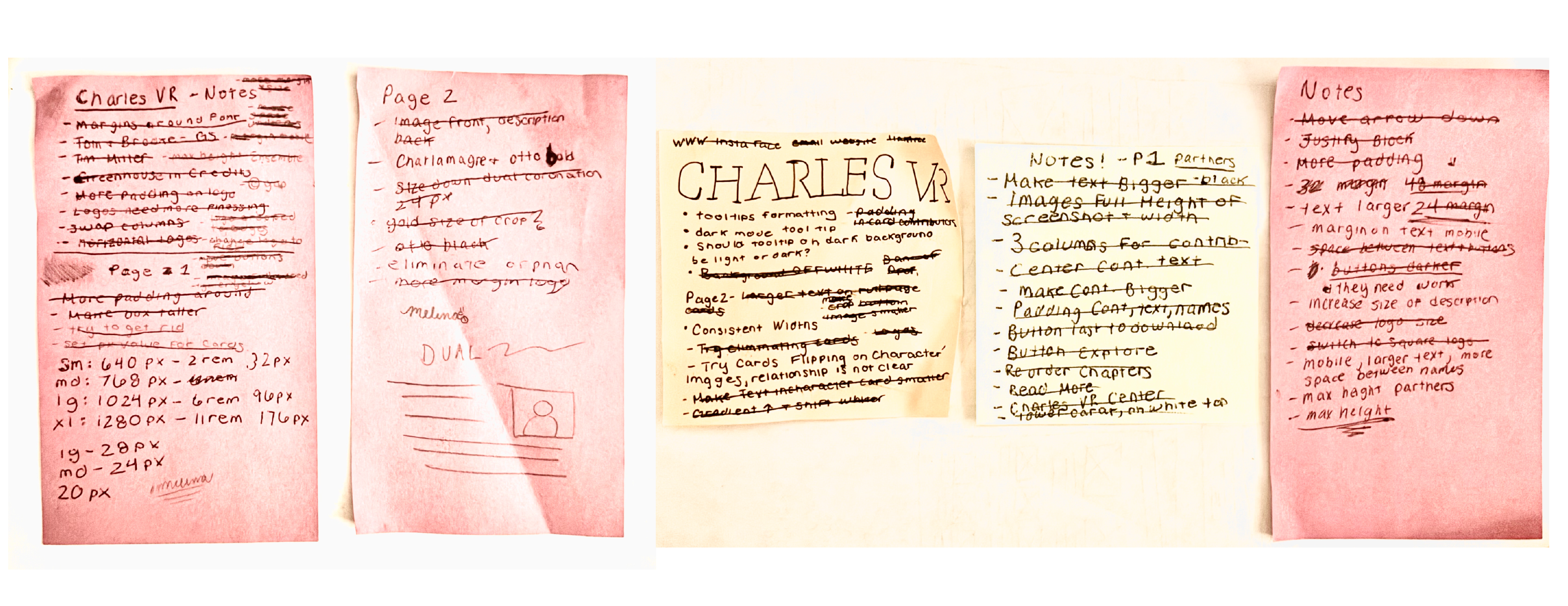
After solidifying the color blocking of the website, I wanted to figure out how this would be laid out for the home page. My team and I worked on some sketches to ideate how the content would be laid out on the page.


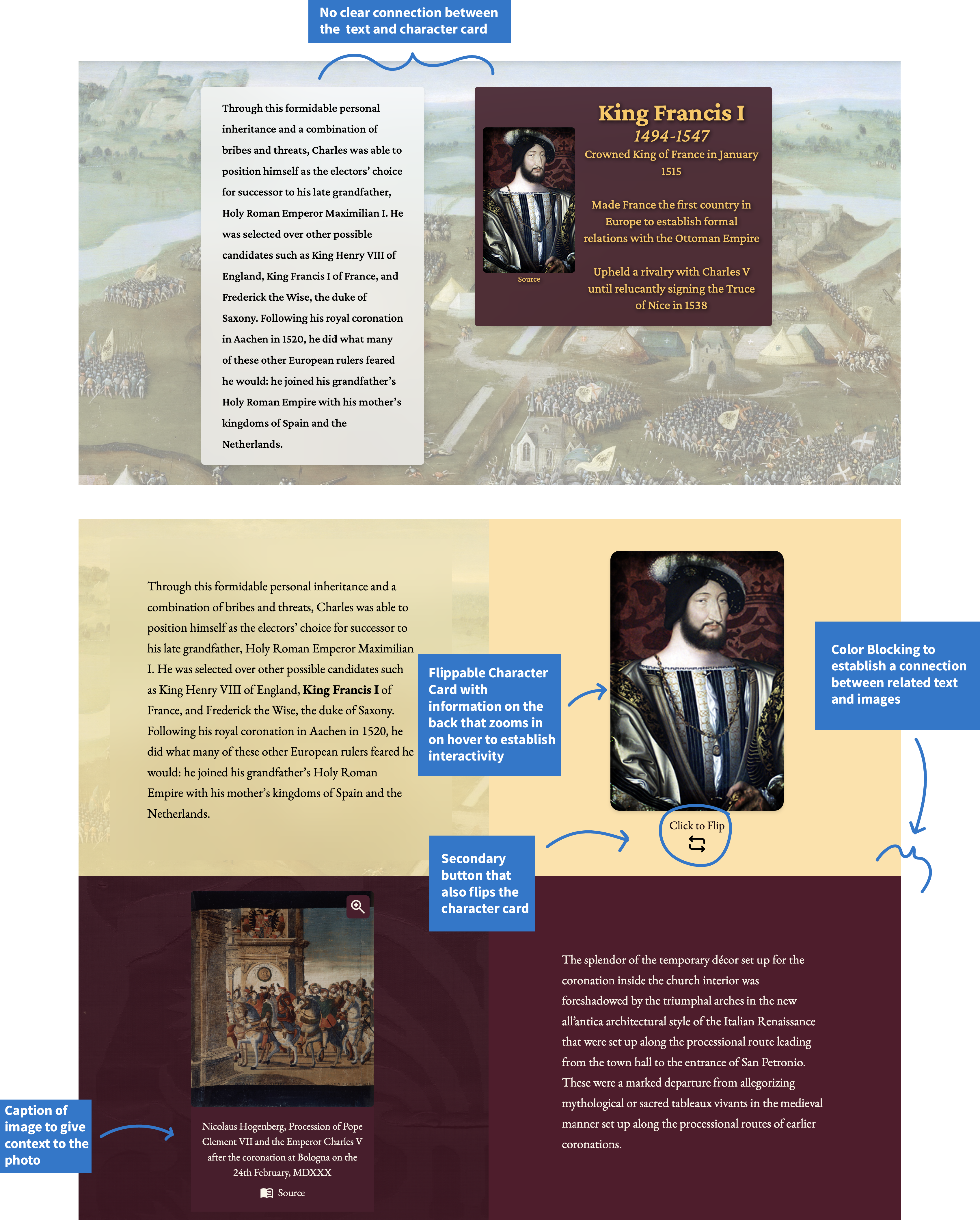
After coding out the website with the first style tile, I ran some user tests with coworkers to gather opinions on the layout. Their main concern was that the text boxes become lost in the very detailed backgrounds. Additionally, the font we used, Crimson Pro, was a little difficult to read. I went back to the drawing board to figure out how to create a layout that was cohesive, and also created a lot of contrast between the foreground and background.
Feedback from usability tests with my team
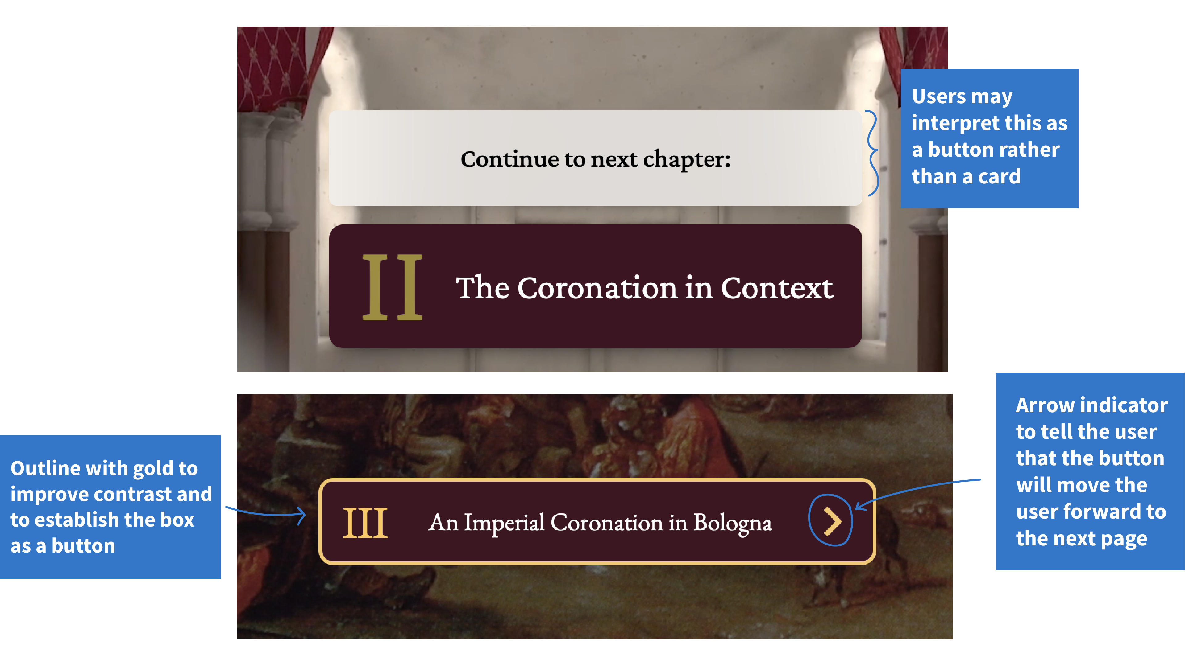
The website relies heavily on text boxes above the buttons to give context to the actions of the buttons. On my first scroll through I tried to click the text boxes and was confused when I wasn’t navigated to the next page
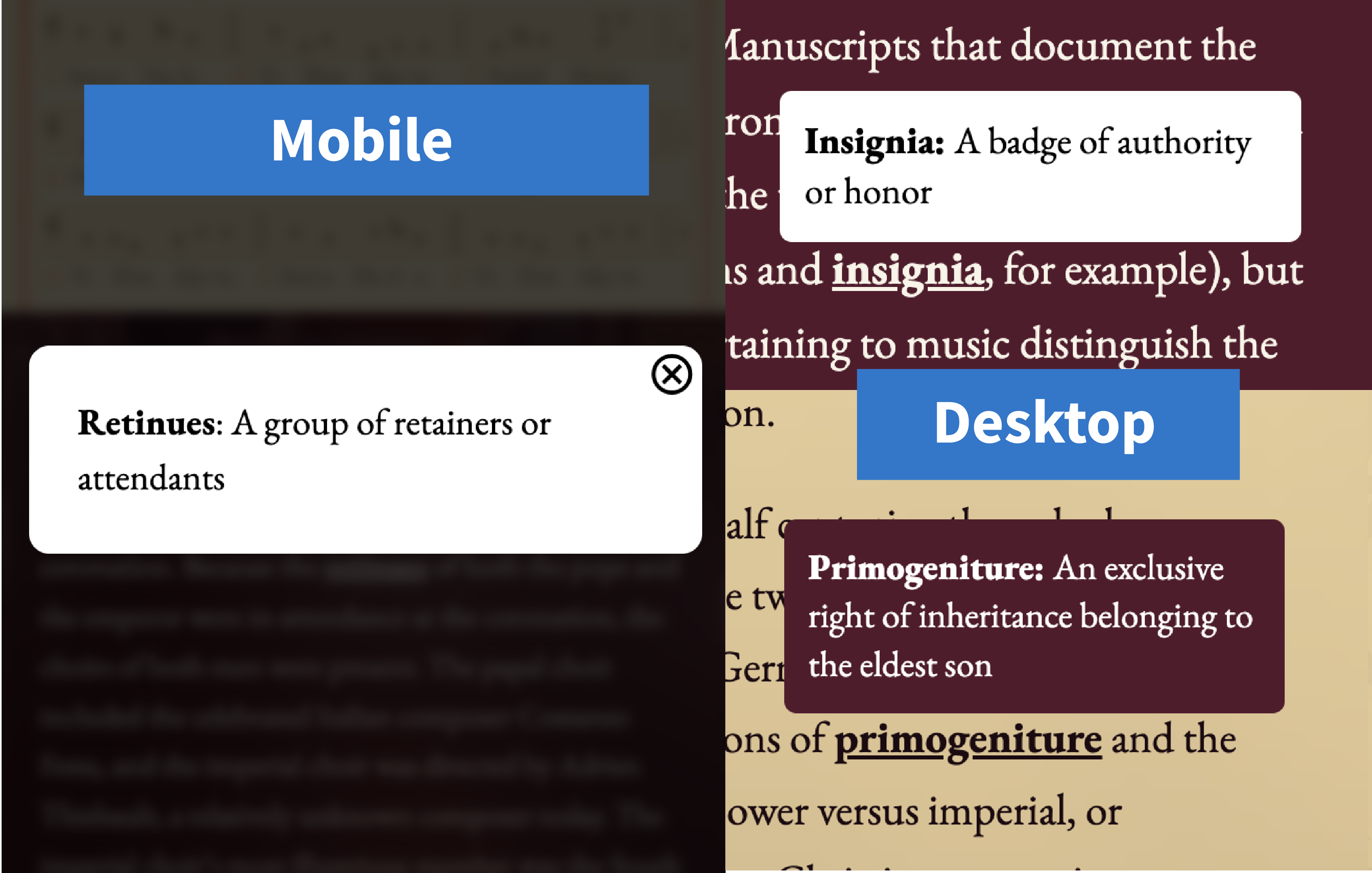
At first, I designed for the desktop layout, creating a white background tooltip that would appear on hover for each of these words. However, during user testing, this proved to provide not enough contrast, especially when paired with the yellow background. I went back to the drawing board and decided to settle on a sort of light mode and dark mode for tooltips opting for a white background and a maroon background.
The next issue was how to deal with mobile tooltips, as hovering is not an option. The solution we came up with was a modal pop up window that would display the definition of the word. The definitions would be displayed on a white background with a black blurred scrim to draw attention to the definition. User could click out of the pop up window by either clicking on the close button, or clicking outside of the modal window
While I was working on this project, I learned the value of conducting user tests on my work. Having people go through the website on their own computers and phones was incredibly helpful to solve any issues in the code and to check for responsiveness in mobile. I also really enjoyed watching how people interact with the website. For example, on mobile we have a bouncing arrow which directs the users to scroll down, however during user testing people consistently tried to click the arrow as a button to scroll down. This never crossed my mind when testing the app for myself, but shows the value in having others test out your work.
Don't mind the dog photos, thats my dog Rudy and we use him as a placeholder :)