Timeline
December 2023 – Present
Role
Design Researcher and UX/UI Designer
Summary
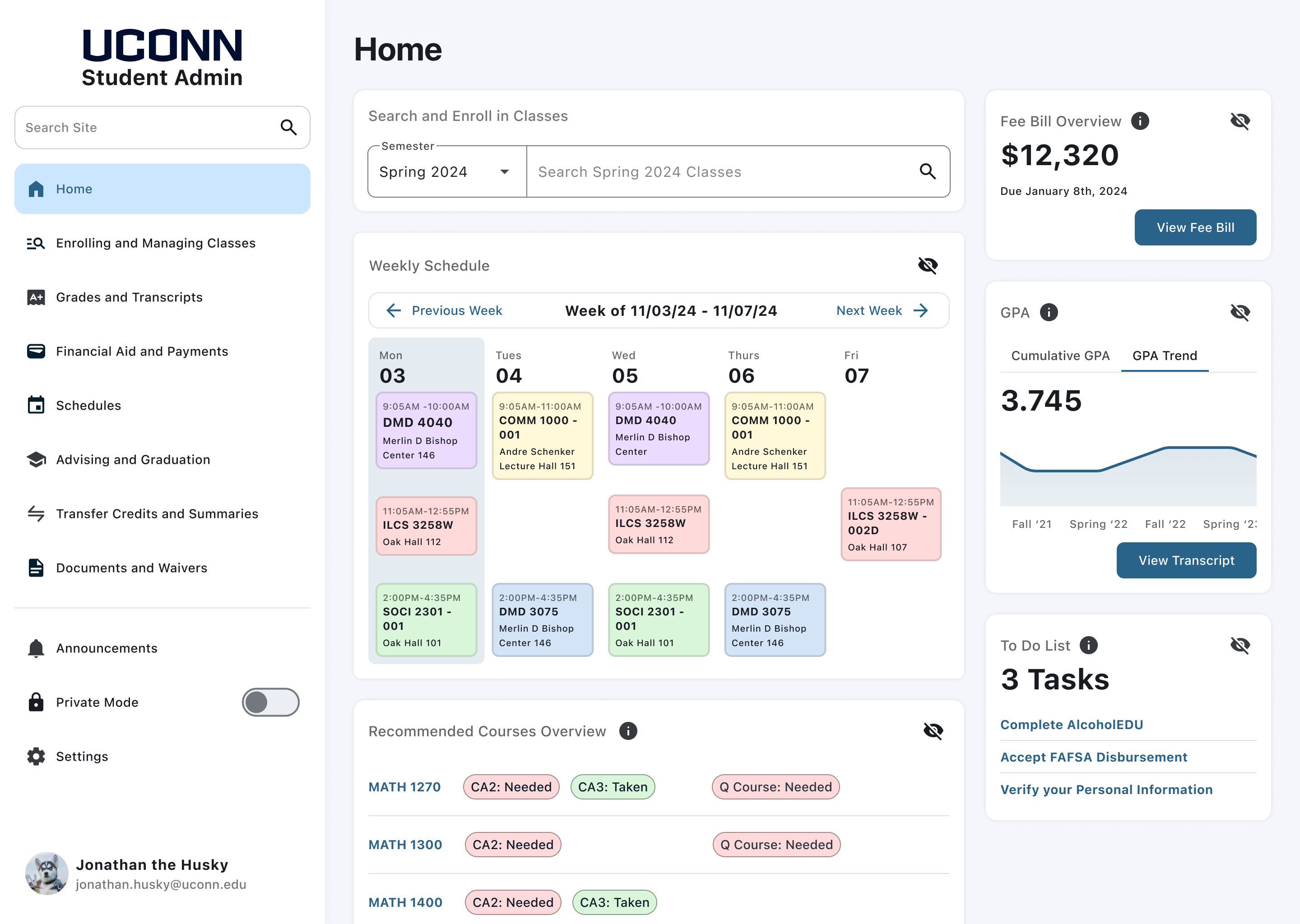
UConn Student Admin is an Oracle Student Information System that students use to view academic information, financial information, and personal information. Students enroll in classes, pay their fee bill, apply for graduation, and more using the interface. Student Admin is a website I and many other students encounter on a weekly basis, I have been involved in many conversations about how much the user interface (for lack of better terms) sucks. For my Senior Design Project, I decided to conduct a case study on the application to see how it can be improved.
Our campus is filled with Student Admin subject matter experts. In order to graduate, proficiency in navigating and using Student Admin is very important. This makes the student body an excellent source for participants in my user testing.
Current State
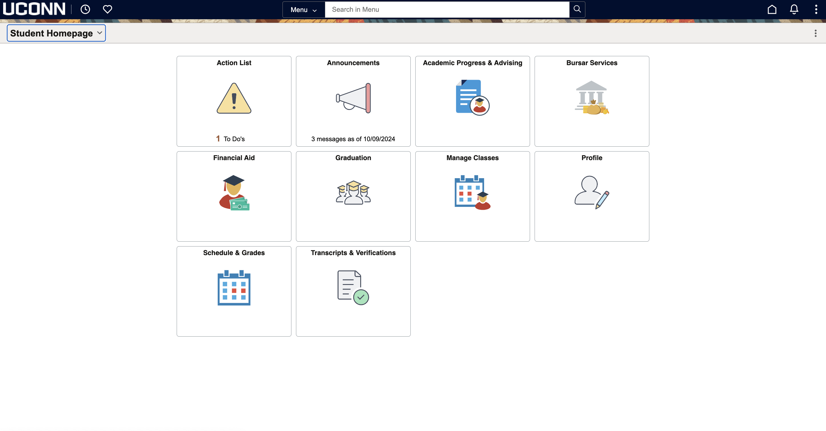
As my advisor once said when I was interviewing him for this project, “The homepage of student admin is a wasted opportunity.” The site gives equal weight to all the different functionalities. Additionally, the navigation is clunky, resulting in having to go in and out of pages without proper back buttons. However, I wanted to validate that these were the impressions of the general student body. I created a survey to assess the tendencies of the user base and their pain points with the site.
Survey Results n=129
I disseminated this survey through the UConn daily newsletter, which gained some traction allowing for an even distribution of years and majors.
Top Five Most Used Functions of Student Admin
1. Finding and Enrolling in Classes
2. Viewing Schedule
3. Bursar Services
4. Viewing Grades
5. Viewing Transcript
Average Usability Score: 5.9/10
At this point, I was working under the assumption that the Student Body were the subject matter experts, and relying on their input solely would suffice for my research. However, one response from the survey piqued my interest, and made me reconsider my opinion...
“So, I work at the One Stop Student Services Office... The people who are impacted the most by the oddities of student admin are our international, first gen, and transfer students.”
After reading this response, I realized that relying solely on the student body was only going to give me half of the story, and rather, I should look to the professionals who interact with the student body as well. I immediately contacted the person who left this response on my survey. I scheduled an interview and started to figure out what exactly I wanted to get out of our conversation.
Carlie Kubisek Interview Takeaways
Carlie works at the front desk taking walk ins and phone related to classes. Most of her questions are related to finding transcripts, enrolling in classes, utilizing the planner, and applying for graduation. The questions range from being about where to find information to what information means
There is no onboarding process for students in student admin, she was trained 3 years ago by shadowing someone which was very helpful. Knowledge based articles exist, but they live outside the platform
The majority of the cases she deals with are from First Gen and Minority student. For example, some first gen students aren’t familiar with the Monday Wednesday Friday schedule because no one in their life has had that schedule. For international students whose first language isn’t English, words such as “Add”, “Drop”, and “Swap” can get confusing. The shopping cart language is another pain point for International Students, as they sometimes think that they are already enrolled when it is in the shopping cart
The tiling on the homepage can be confusing, there are many places for you to add classes, with some enrolling you and some not enrolling you. The academic planner can be problematic, especially if you are creating an advisement report, because planned courses are counted as already taken
Based on this interview, I based my wireframes on the question:
How might we replicate this onboarding process inside the portal so students can become Subject Matter Experts like Carlie to improve the user experience?
Mike Ormsby Interview Takeaways
After this conversation, I scheduled an interview with Mike Ormsby, the Director of One Stop Student Services at UConn. One Stop Student Services oversees FAFSA and class registration. I wanted to widen my perspective on Student Information Systems by learning about the general field itself, and his work with.
Mike joined UConn as the Director of One Stop Services over a year ago, he oversees Undergraduate Admission, Registration, and Financial Aid. UConn utilizes Oracle PeopleSoft for Student Admin, but prior to UConn he used Banner when he worked at the University of Hartford.
The two main software he is familiar with are PeopleSoft and Banner, while both systems are archaic, he prefers Banner because Banner allows you to see a variety of information on one screen such as the GPA, credits, and schedule. Banner is used at smaller institutions so there is more customization, therefore, a better user interface
The main issue with student admin is not where the information lives, but what it means. For example, students can access their financial aid package, but they struggle to understand what it means
After this interview, I formalized the next question that guided the design of my wireframes:
How might we clarify the language in Student Admin, so the functions of each feature and their potential repercussions are clear?
After learning about Mike's experience with Banner and Peoplesoft, I wanted to research this other software to see how their UI differed from one another.
The main Student Information System software utilized by universities are:
Oracle PeopleSoft
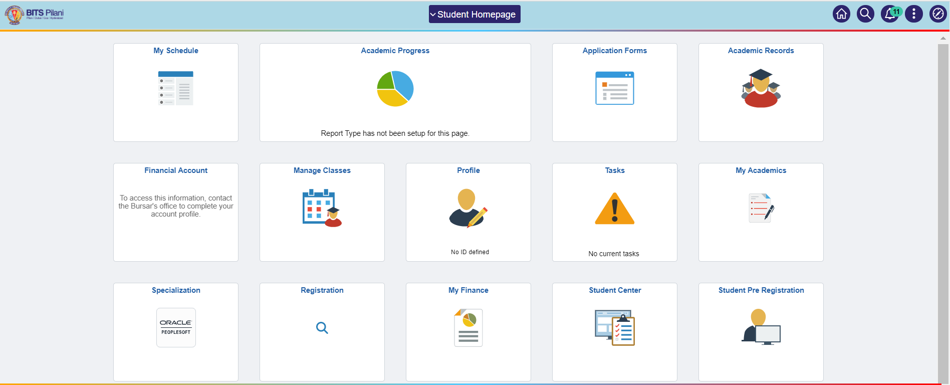
Oracle PeopleSoft is the most common Student Information System on the market. Schools such as the University of Connecticut and Penn State University rely on the software to store student information. It is characterized by its tiling UI on the home page, which users can drill down into to find out more information on each section.
Ellucian Banner
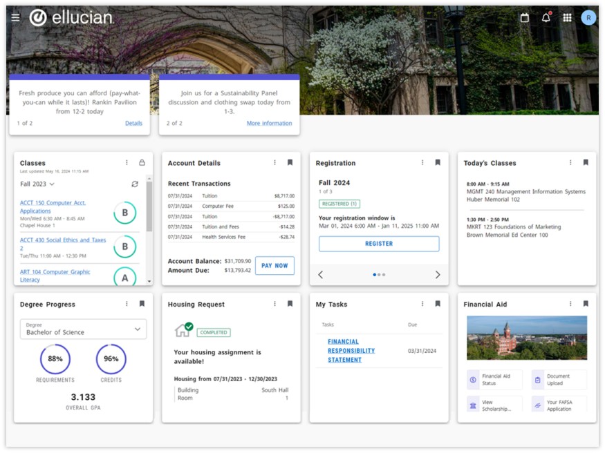
Ellucian Banner is used by over 1,400 campuses such as Oral Roberts University. It allows for seamless access for students to plan, register, and build schedules. It gives advisors guidance on recommending classes for students and showing trends to them so they can see their progress to graduation. Rather than relying on a side navigation, it utilizes a homepage tiling schematic like PeopleSoft.
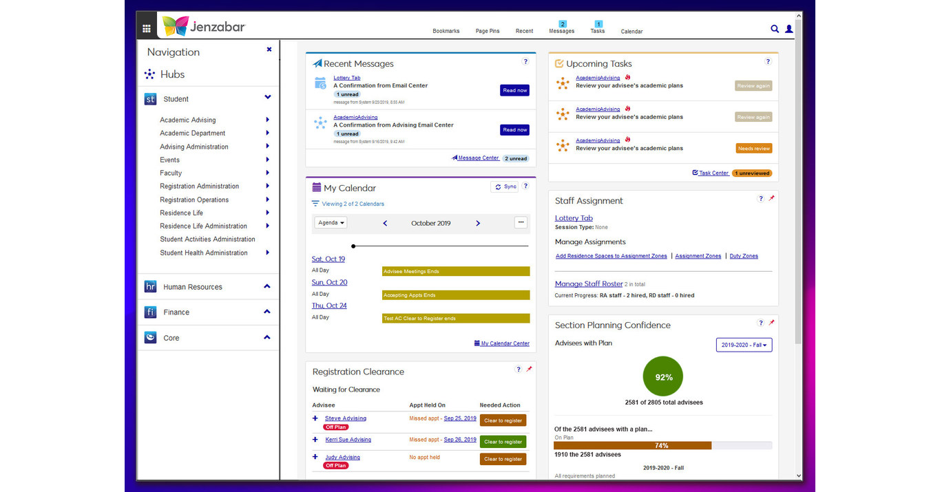
Jenzabar
Jenzabar is used by over 1,400 campuses such as Gordon College. It is characterized by different “Hubs,” that organize information by category.
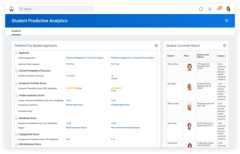
Workday
Workday is used by universities such as Wake Forest and University of Rochester to store student information. Workday is characterized by its customizable home screen with key features such as announcements. It works alongside other Workday applications such as Workday Financial Management and Workday Grants Management for seamless integration. Workday focuses its attention on understanding the 3 user types, students, faculty, and administrators and tailors its interface and information to each user. It is characterized by its dashboard layout with broad side navigation that can be drilled down for more information.
From my conversations with Mike Ormsby, I learned there were opportunities for developers to build on top of PeopleSoft's user interface, however, UConn avoids that because it slows down the refresh time, so I assumed that all other universities refrained from building on top of the template. However, when having a conversation with my twin brother Gavin, a senior at Penn State, I realized that his school uses Oracle PeopleSoft as their Student Information System, and their homepage layout looked completely different from UConn’s...
LionPath Demo
LionPath, similar to Student Admin, is an Oracle PeopleSoft software utilized by tens of thousands of Penn State Students every day. However, LionPath differs from UConn Student Admin in its implementation of the home screen. LionPath has at-a-glance information such as schedules upon login, while UConn’s Student Admin has no information upon first login. My brother highlighted how helpful it was to have all this information with the click of one button. I realized that the home page was an opportunity to make Student Admin more helpful

User Persona
After collecting all this information from my interviews and research and analyzing the data points, I created a user persona to help me empathize with the Student Admin user pool so all my designs would be intentional to catering to this user type
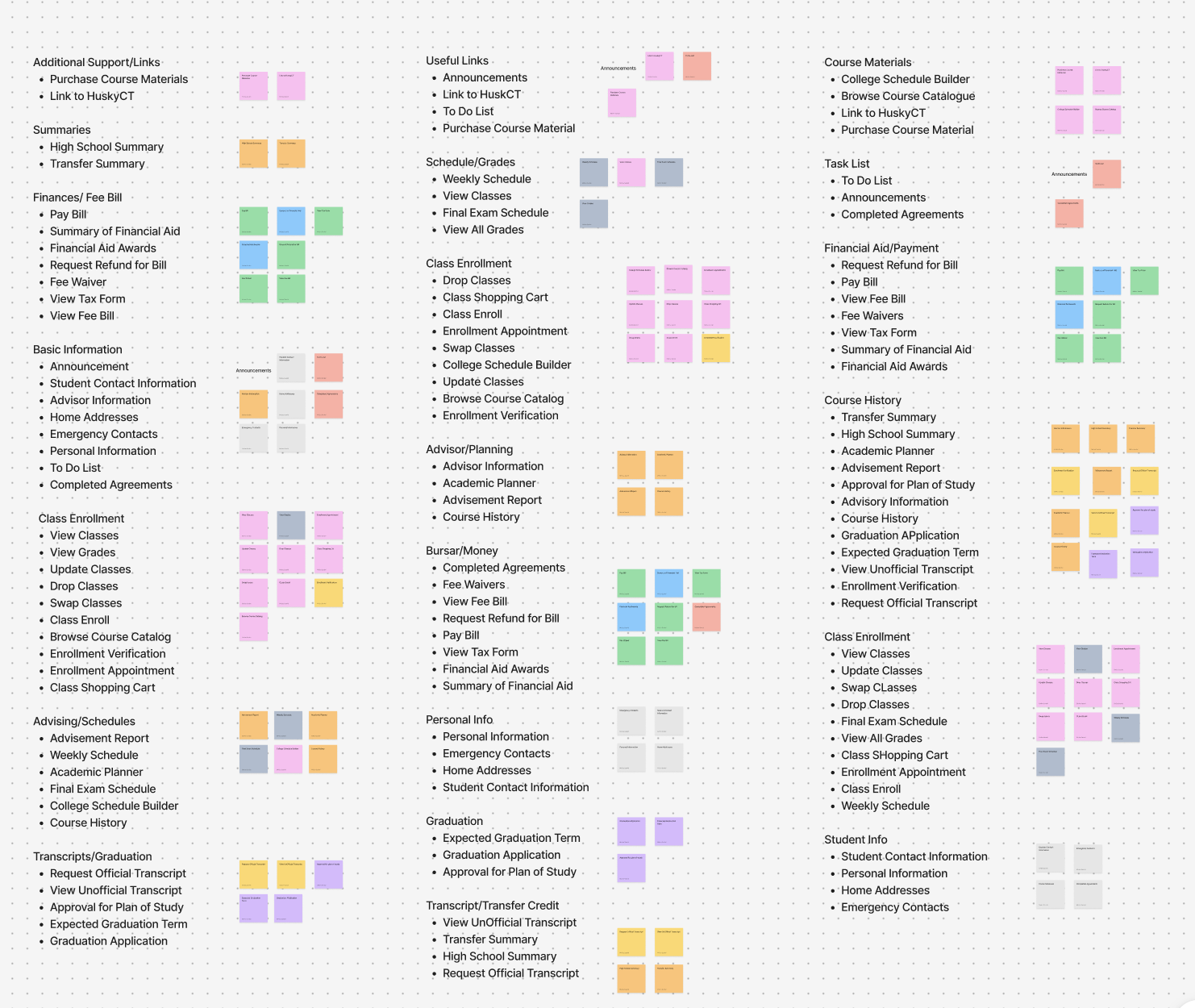
Card Sort
The next step in my process was nailing down the information architecture of the site. I held three separate card sorting tests to see how users group the information within student admin. I decided to have the card sort be open, rather than closed, to give the participants the freedom to label their own groups so I can base my group names on the data.
All participants in the card sort grouped together Financial Aid and Bursar Services. Additionally, the average number of groups that participants created was 7, while there are 10 distinct groups in the current student admin. From these findings, I knew that I wanted to consolidate these groups into larger groups to make finding information a lot easier.
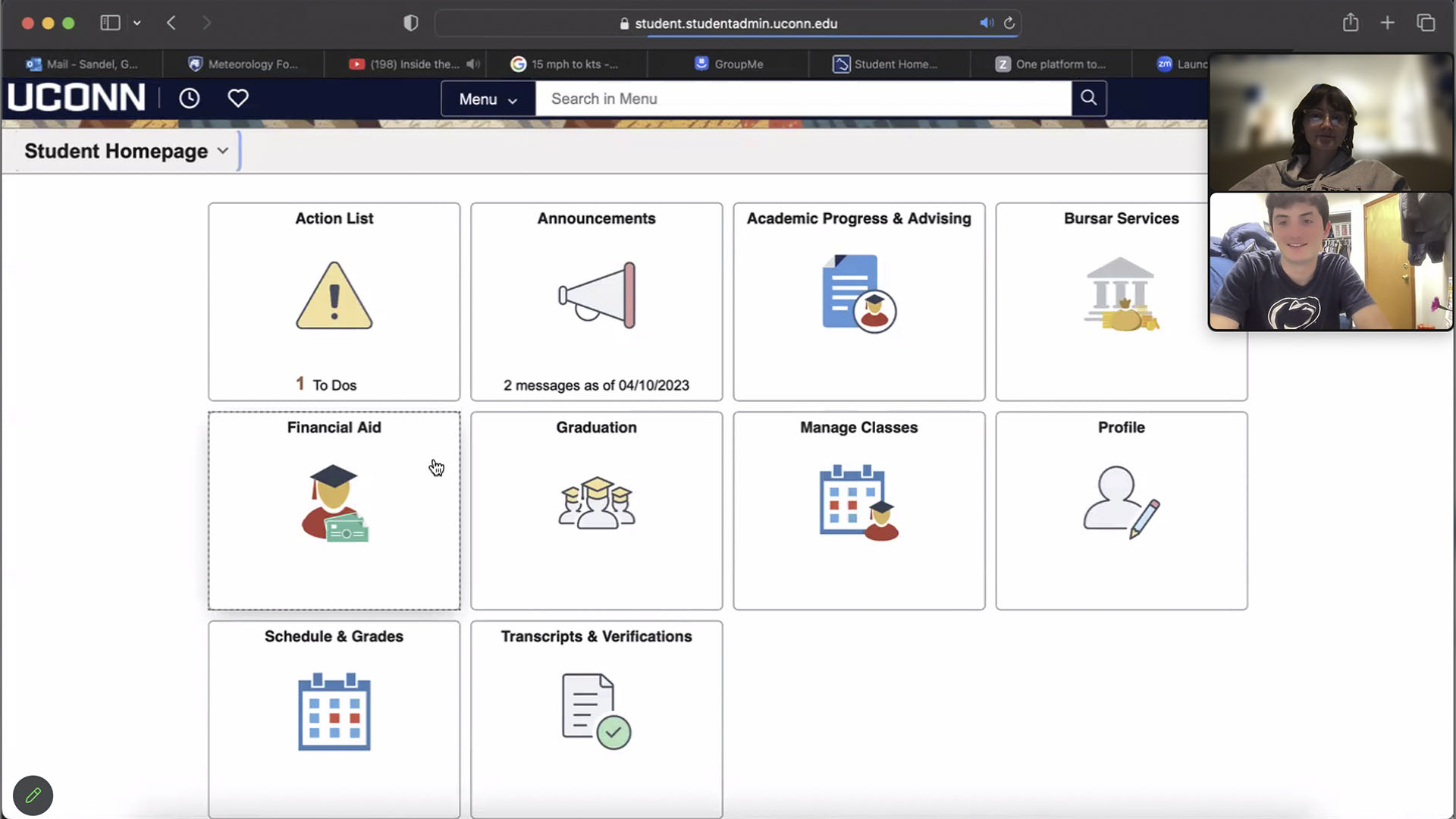
Moderated Usability Test
My research efforts had already tapped into the student body and those who assist the student body with Student Admin. However, I wanted to broaden my scope to non-UConn students, because they bring a fresh perspective and may notice issues that people who use the platform have gotten used to and therefore overlook. I decided to contact my brother once again for his help to have him complete some common tasks within Student Admin to get his initial reaction. The tasks included:
1. Finding the 1098T Tax form
2. Finding an Enrollment Appointment
3. Finding the Unofficial Transcript
Gavin had an easy time finding the 1098T form, however, the same cannot be said for the enrollment appointment. He originally clicked on Academic Progress and Advising to check the planner, then doubled back to manage classes and found the enrollment appointment. Gavin also struggled to find the unofficial transcript because it was not clear that the page was scrollable. He then checked the Course History and the Advisement Report before eventually finding the unofficial transcript
After completely the moderated usability test, I let my brother browse the site and give his unfiltered opinions aloud. Some insights of note include:
1. The home page is sorted in alphabetical order rather than importance which is unintuitive
2. Many of the tables that have multiple dates default to showing the first semester enrolled, and most people want to see information from the current semester
3. Many of the pages have a lot of text on them, which users may not read
4. No clarification on what a permission number is
5. Sometimes the back arrows can be misleading, and cause you to lose progress
6. View Classes is in two groups
After chatting with my brother, a technologically savvy student, I decided to get the perspective from someone with less technological experience – my mom.
I held the same remote moderated user test with the same tasks, but this time, I had my mom use her phone. Both participants had the same struggles with finding enrollment appointments, however, my mom became incredibly frustrated with the process. It was a struggle to get her to complete the open browse. However, she reluctantly obliged, here were some of the findings from her experience
1.Some words such as GA Payroll Deduction and Pay Convera are confusing, and do not have a lot of contexts to explain what they are
2. Some pages do not have a back arrow making navigation difficult
3. There is information overload on some pages
Overall, this confirmed my findings from my interviews with Mike, that information is not explained well, which causes confusion.
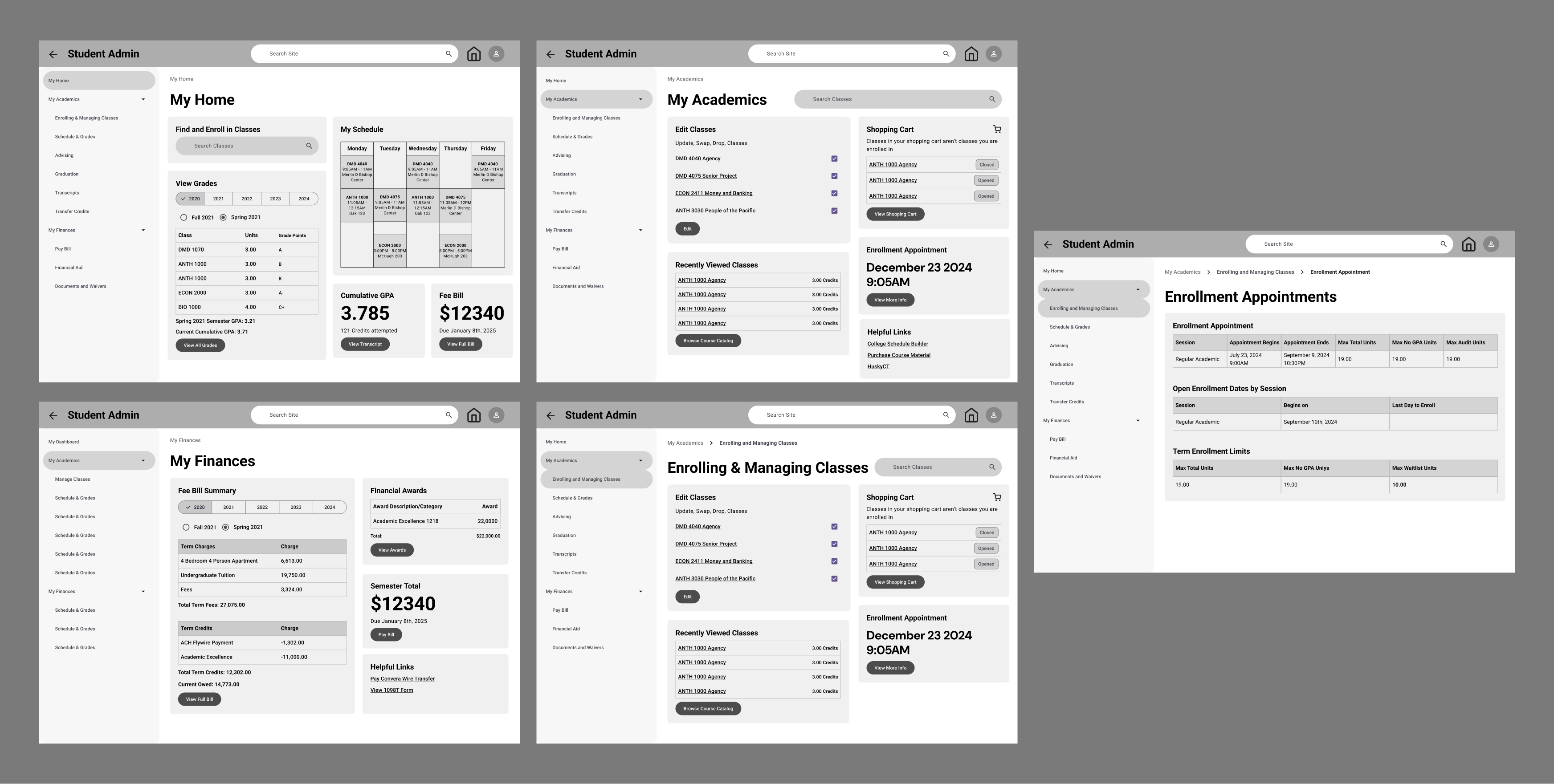
Initial Information Architecture and Wireframes
Keeping in mind how Jenzabar implemented different “hubs” in their information architecture, I created an Academics and Finances hub to categorize information. I hypothesized that this grouping would be intuitive for students. Additionally, taking into account my demo of LionPath, I wanted to incorporate at-a-glance information on the home page to eliminate drilling down to find information and to allow for cross referencing of information. To speed up creating wireframes, I decided to use Google’s Material Design Figma plugin to help with quickly creating components to use in my wireframes as stimuli. I wanted to focus on the information architecture rather than the user interface for my wireframes, so I could nail down the content and interaction patterns. Additionally, I planned to use Material Design components as a reference for my design system for my UI, so using these components in my wireframes would get me more acquainted with the components and their structure.
To get a baseline on Student Admin, I conducted A/B testing with my wireframes and wireframes reflecting the current state of Student Admin. I hypothesized that having at a glance information would be more beneficial for users than the current display of information in student admin, so I created 2 separate stimuli, one reflecting the direction I wanted to take with Student Admin, and one that reflected the current display of information in Student Admin. Additionally, I wanted to explore global navigation that is consistent on all pages to eliminate recall of the home page, so I designed a side navigation pattern that persists on all pages.
“I prefer [your wireframe] because everything is on one screen, it is straightforward, and intuitive”
- Participant 4”
I held user tests with 6 participants, which took around 15 minutes each. 3 participants tested my wireframes first, while the other 3 tested the Student Admin wireframes first to eliminate any bias. All participants appreciated the at-a-glance information on the home screen rather than the tiling. 5 out of 6 participants preferred my redesigned wireframes of student admin, while one participant had no preference between the two. Students found both wireframes to be extremely useful, with the differences in the usefulness ratings for both pages being the same. No participants found the academics or finances dashboard. Additionally, multiple participants noted privacy issues with the at-a-glance information immediately upon logging in.
The privacy concerns were high urgency .For my second iteration I wanted to nail down the privacy affordances. However, my standard for private information is different than other students. I created another survey to assess if there were any common trends on what information students deem to be “private.”
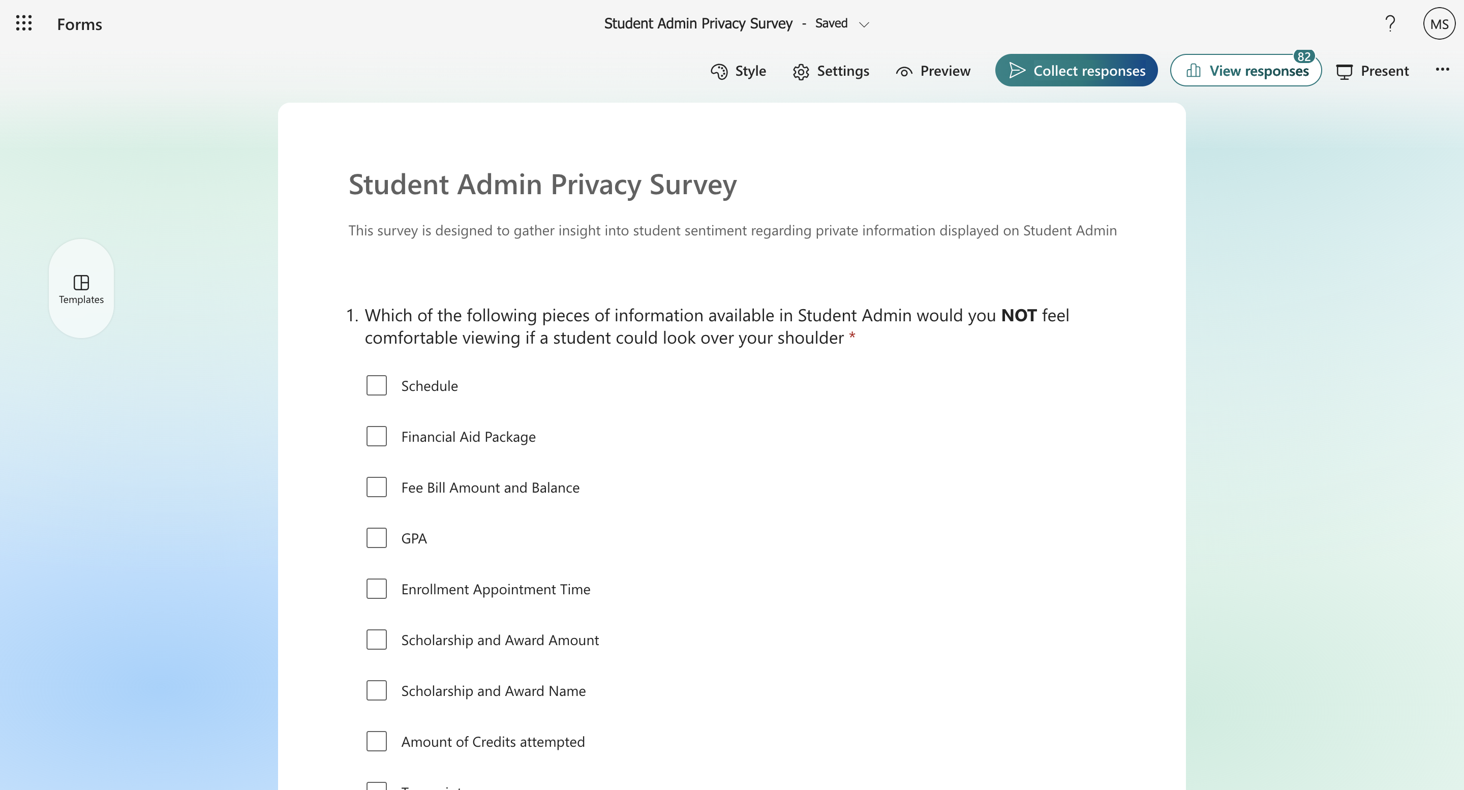
Privacy Survey
n=80
The survey revealed that students do not have a common belief on what information should be private. From this insight, I came up with the idea for privacy to be customizable. I hypothesized that by creating affordances to configure your privacy, students would feel the same level of comfortability to open student admin in their classes as they do with the current student admin. This came to fruition in Public and Private Mode. Public mode showing all information when you first log in and Private Mode, hiding the information you do’t want shown when you log in.
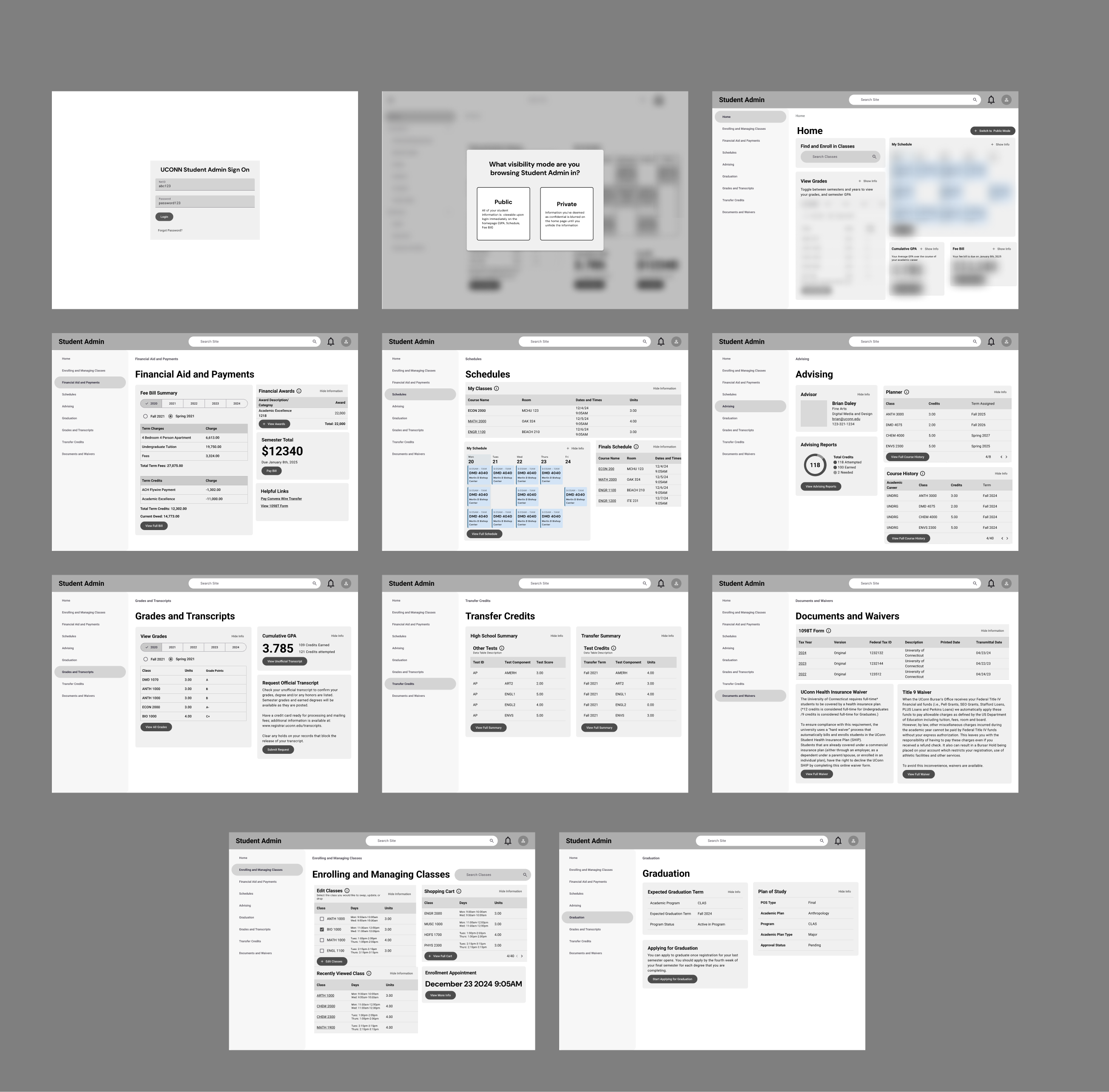
Wireframe Iteration 2
Additionally, I wanted to test out the information architecture by prompting users to predict where information would live on the site. I wrote out a script that contained 2 parts, the first to test out the Private and Public mode, and the second to predict information on each of the pages and whether or not it met the participants expectations. I recruited 5 participants from different years and majors and began facilitating user tests
I had 5 rounds of user tests; similar to the survey results participants were split on how often they used Student Admin in public with some saying they often use the website in public and others saying they rarely use it in public. Some felt very comfortable viewing student admin around others while others never viewed it around others. The most frequent locations students opened student admin was their room or class. Each test lasted around 30 minutes each.
“I like private because it gives you the comfortability to view information anywhere”
- Participant 11
All participants appreciated privacy mode, and varied in how much they would use it. The biggest insights were tweaks to the information architecture and the names of the categories. For example, most participants had trouble finding their high school summary and course history. Also, multiple students noted that the default date for information should be the current semester, rather than the first semester you are enrolled, which parallels what Gavin said in his browse. The biggest opportunity for exploration based on feedback was in the Graduation page. When I asked participants what information they expected to find on the graduation page. many noted they expected to find data about Graduation progress, which currently does not exist in Student Admin.
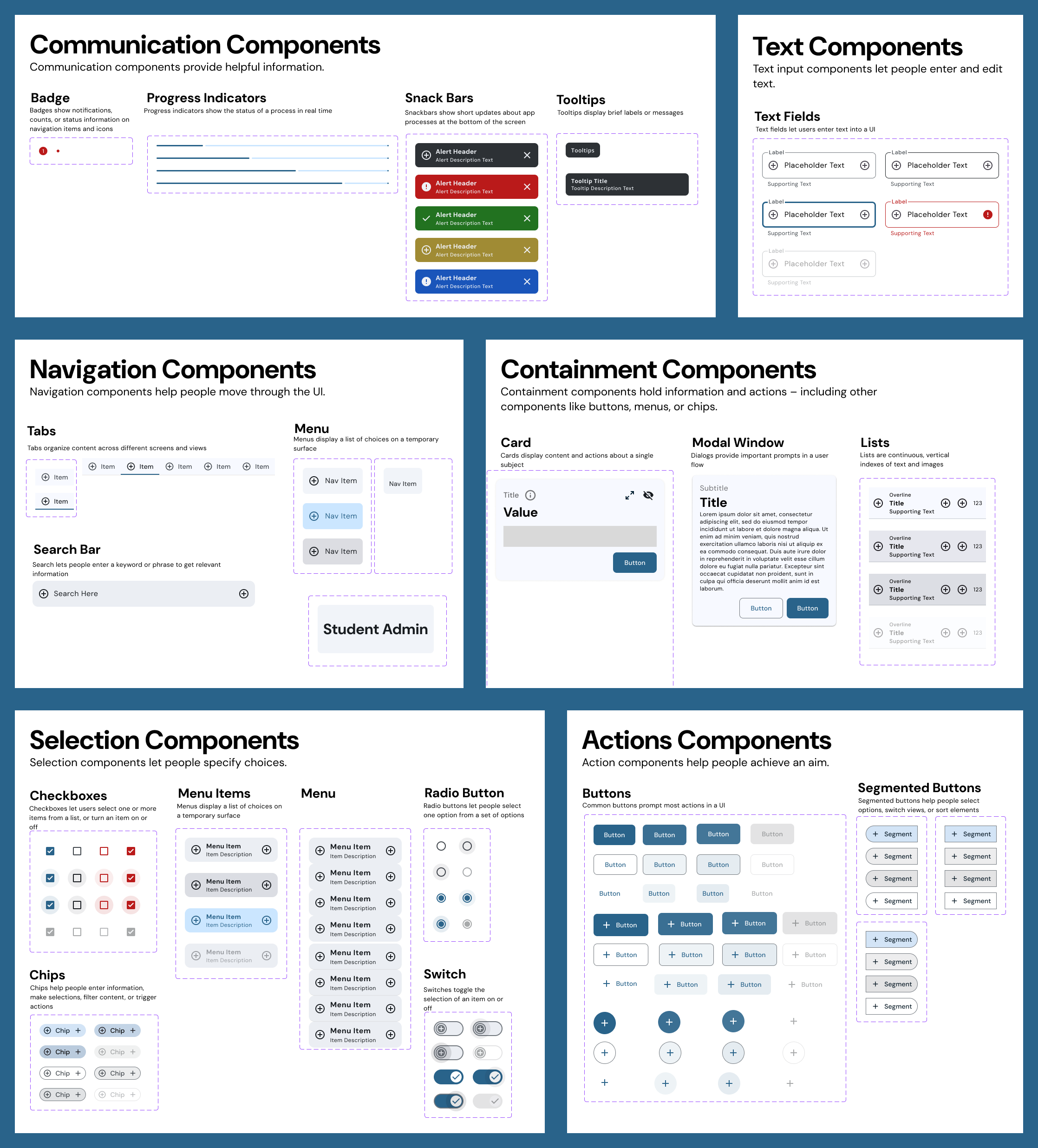
Design System
After wrapping up my wireframes, I decided to pause the wireframe work and get started on my Design System. I used Google’s Material 3 Design System as a foundation for my colors, typography, and components. Google's Material 3 is backed by extensive research, so I knew using this as a basis would lead me in the right direction. I used the Material Theme Builder Figma plugin to generate color tokens applied to all my components. After this, I created all my components from scratch, with variants to make customization easy and allow me to keep all the components attached.
Once I finalized my design system, I dove straight into the UI. During this process, I made some changes with the color palette, as well as the fonts to better accommodate the dashboard design. Based on my conversations with other students in my major, they associate a blue color scheme with Student Admin and academics, rather than the yellow-orange color scheme currently in Student Admin. I adjusted my wireframes to reflect these sentiments
I created a component library in Figma utilizing Figma’s variants to reduce any detaching of my components and allow for the maximum amount of customization. Additionally, I organized my Figma file by portion of the design process to streamline my workflow. I used pages to section off the different portions of my project such as Wireframes, UI, and Design System.
After polishing my components, I resumed work on the wireframes. I began the process of converting my wireframes into high fidelity designs using my design system.
UI Iteration 1
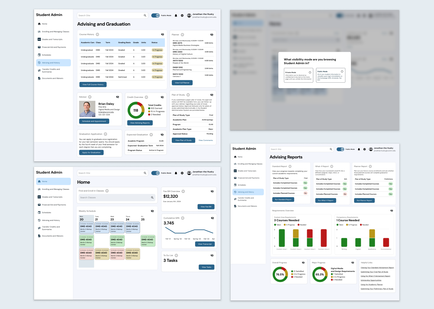
Right off the bat, I wanted to explore the graduation screens and how we could visualize student academic data. As I began to work on the UI, I referenced the other student information systems, mainly Workday, to see what types of graphs they were using to visualize information. I decided to use pie charts to represent credit progress. I also experimented with bar graphs to represent fulfilled competencies which I later scrapped. Based on my own planner, I created graphs to visualize progress completing Content Areas and competencies, however, I wanted to ensure I wasn’t missing any requirements, so I incorporated questions about requirements into my testing script for my warm up questions.
I held 5 rounds of testing with five participants ranging from sophomore to senior. User tests took between 15 and 30 minutes. During my designing I hypothesized that displaying a GPA trend would be helpful to motivate students to raise their grades. However, during my testing, the most surprising insight I found was that the data in Student Admin holds a lot emotional weight. 3 out of the 5 participants mentioned that imagining their own GPA trend would cause them distress. This was a major turning point for my designs: I needed to be deliberate with the UI choices I made with my designs, because they can impact people's mental health. I reflected on the first and second round of testing and realized that participants were relating their emotions to data from the start. Multiple participants noted the font sizes of the initial wireframes to be problematic, because seeing their GPA or Fee Balance in large text would give them anxiety. Moving forward, I needed to be more deliberate with my designs.
During this user test I had participants review the overall content of each page. One common theme which linked back to Mike Ormsby’s interview was confusion about what information meant. The shopping cart, planner, and grade calculation caused participants issues. In my experience, I felt that all of these features were self explanatory, however, I am a senior with high level knowledge of the platform. The majority of these questions were coming from underclassmen participants. I really needed to approach this design in the shoes of someone who has never touched student admin, like my mom.
UI Iteration 2
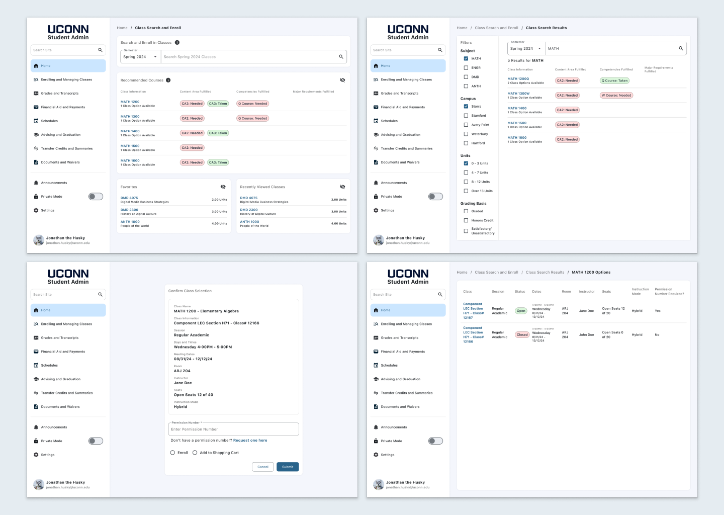
Based on the insights about contextualizing Student Admin features, I added more tooltips and descriptions to cards to give an accurate depiction of their functionalities. In my final iteration, I also wanted to address class enrollment. Based on my the survey insights from the beginning of my design process, the most used function of student admin is the searching and enrolling in classes, and it is also one of the biggest pain point for students. I wanted to create a more efficient way to enroll in classes to give students more context to the requirements that these classes fulfill. In order to graduate, students need to complete a set of requirements and competencies. These requirements and competencies are fulfilled by different classes, and are noted in the course catalog, which lives outside of student admin. I hypothesized that by adding this information into Student Admin would allow students to feel more confident in their academic decisions, and act as one source of truth for deciding what classes to take.
While I knew enrolling was frustrating for students, I wanted to know why. When writing out my script, I wanted to ask some warm up questions that would give me insight into students rationale when enrolling in classes: What goes into their decision to pick a class? What other information do they cross reference when picking a class? What frustrates them the most about the process?
The insights from these primer questions were incredibly interesting, and contradicted my designs that students were testing. While I thought that students would cross reference their academic planner and the course catalog, most students pick classes based on what their advisors recommended. Additionally, the most cross referenced resource is Rate My Professor, so students can get insight into honest reviews on professors and the courses they teach.
“I like how it tells you the content areas you have taken and need.”
- Participant 15”
Participants ranged from sophomores to seniors. They all appreciated the chips displaying the Content Areas and Requirements that the classes fill, however, the majority of participants expressed that their biggest pain point was being able to actually enroll, rather than picking a class. Many times students will enroll, and not know that they need to input a permission number. Another pain point was unclear enrollment restrictions that block students from being able to enroll. After these insights, I knew that I needed to refine the enrolling form.
Based on the user feedback, I added a column to differentiate whether a class required a permission number to enroll, and also an affordance to request a permission number from a professor to make Student Admin the one source of truth for enrolling in a class.
Highlighted Features
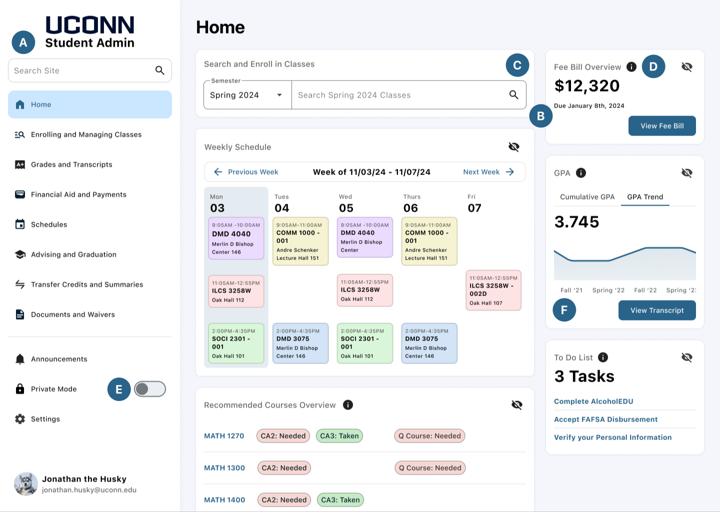
A. Information architecture developed based on my card sort and wireframe insights
B. Content on home page decided based on my survey to find out the most used aspects of student admin
C. Card layout with at a glance information utilized based on my competitive analysis of other Information Systems and my demo of LionPath, Penn State’s student information system
D. Information Icons incorporated based on my interviews with Mike Ormsby, the director of UConn One Stop Services and Carlie Kubisek, a student worker at One Stop, they both expressed how students have trouble understanding the content of student admin
E. Private mode toggle added based on the feedback of my first round of wireframe testing to address privacy issues
F. User interface of the screens are designed based on the design system I created that was influenced by Google’s Material Design System, which is heavily researched
The Final Product
While this project is just a concept, the feedback from the designs at all stages of the design process has been incredible. At least half of the 16 participants who tested my prototypes asked if these changes would actually be incorporated. While I am sunsure if these changes will ever be incorporated into the site, if they ever were to be, it would improve the student body’s academic experience by giving them more context into the classes they are taking, their academic progress, and the functionalities of student admin.
