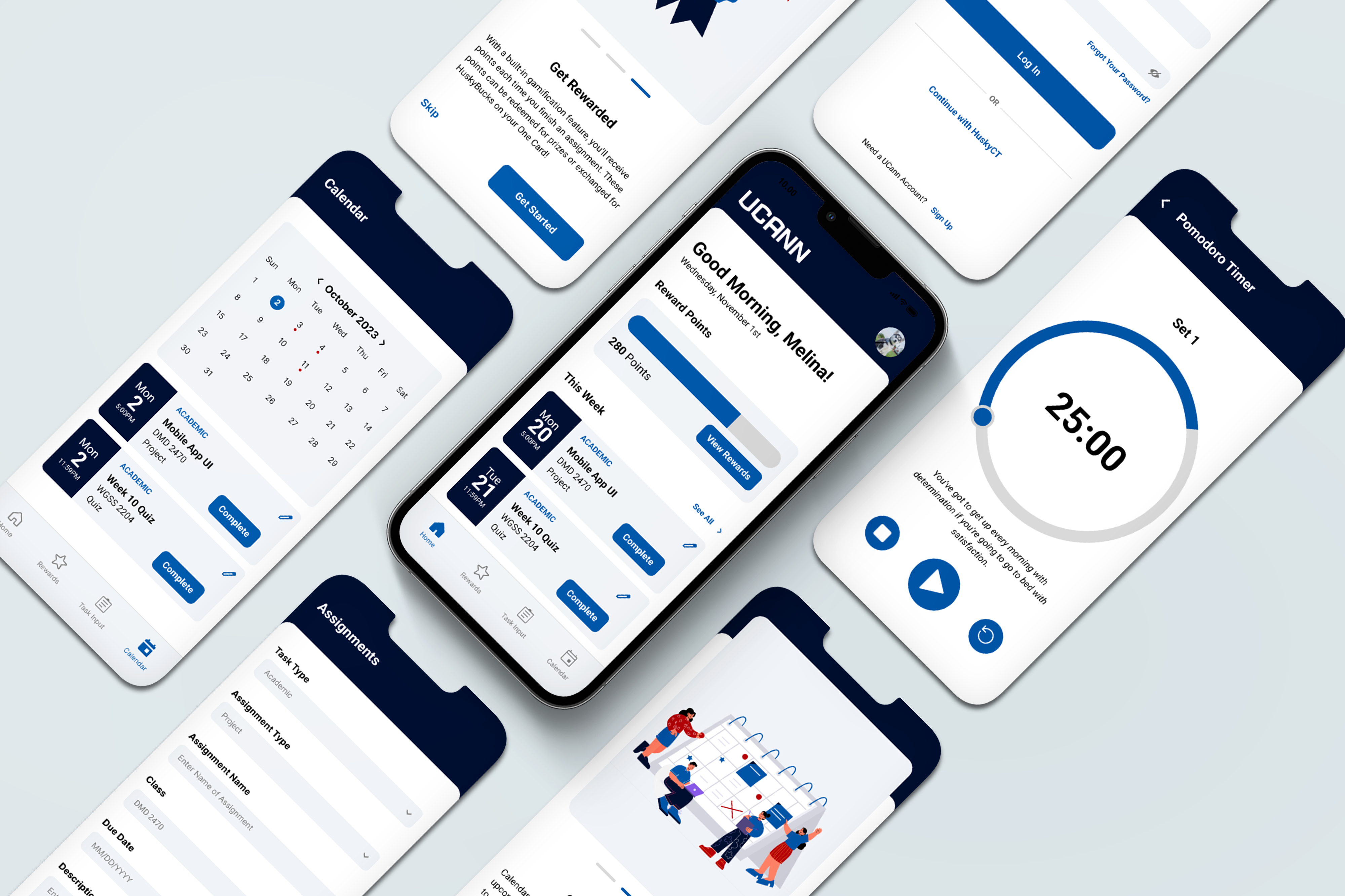
photo of ucann app

UCann App

UX Research, UI/UX Design

Adobe XD

Timeline

September 2021 - Present

Role

UX Researcher and UX Designer

Summary

UCann is a concept app I designed and researched as part of a group project. We were tasked to create a piece of digital media that solves a problem that effects students on campus.
Finding our Problem

We narrowed down the topic of our problem to be adjusting to campus, however we needed to figure out what part of adjusting to campus was difficult. We started out by interviewing students with different backgrounds to hear their opinion on the transition of coming to school.

“It’s definitely been an adjustment but I think I got used to it pretty quickly.”

- In State Senior living off campus with roomates

“There's so much work so I feel like I dont have free time to myself”

- Out of State Freshman living on campus with a random roommate

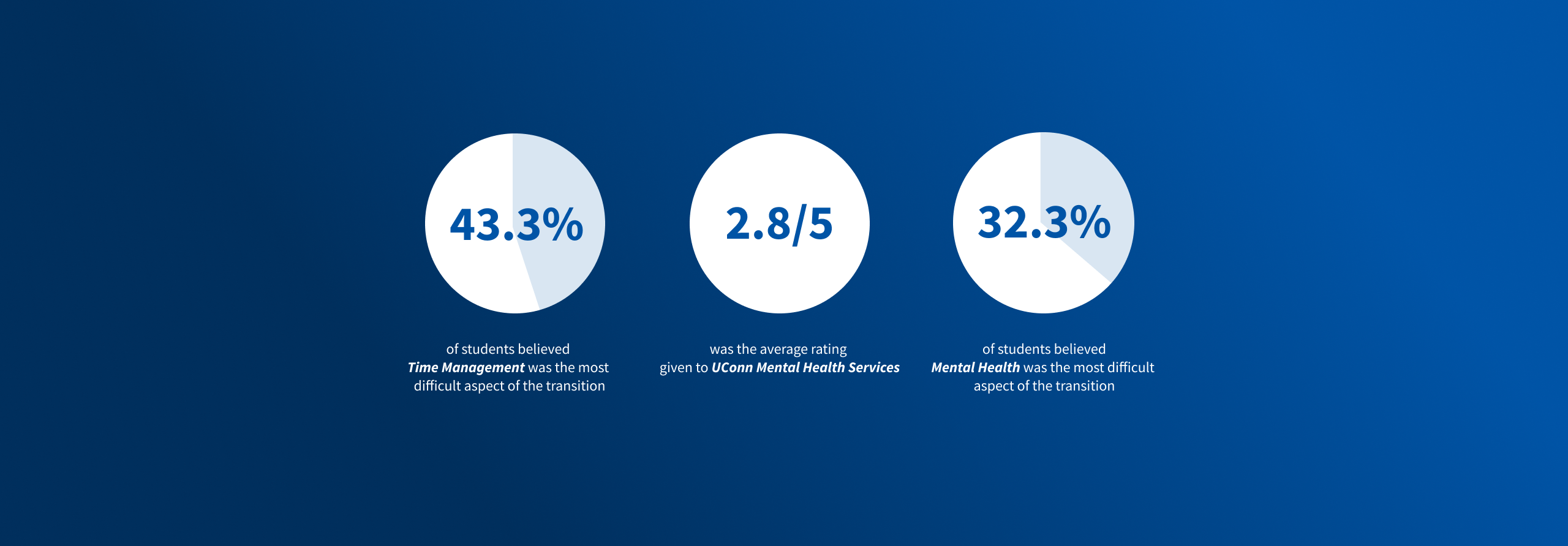
Then, we conducted a survey which received 130 responses. This was to gauge the aspects of transitioning to school that gave students difficulty. The findings in this survey contradicted our initial assumption about students' difficulty getting adjusted to living on campus. Most students felt that on a scale of 1-5 they adjusted to living on their own at a 4. This data shocked us and caused us to pivot our problem statement. 

image of mental health survey
image of survey about transition to college

The most difficult aspect of transitioning for students was time management (43.3%) and mental health (32.3%). We realized that these two issues were connected: If a user was able to improve their time management, then their mental health would improve. This led us to develop our problem statement

Problem Statement

How might we use a mobile app to improve time management skills for undergraduate students at UConn?

After focusing in our our problem, I reached out to an expert in the field of time management, Leo Lachut. Leo is the Director of the Academic Achievement Center.

Key Takeaways

There are 3 facets of Time Management: Attention Management, Life Management, and Self Regulation

Attention Management is how we can focus on a task without getting distracted. Life Management are the unexpected events that derail your plans. Self Regulation is our internal motivation to complete a task. Students track their assignments hour by hour rather than in a big picture sense

There is a correlation between mental health and time management

People suffer from Sunday Scary, which means they have a lot of anxiety for the impending week on sunday. Most heart attacks occur on Sundays.With poor mental health comes low motivation.

There are study techniques to help with motivation

Techniques such as the Pomodoro method, which breaks up the amount of work done at a time helps with students motivation. After COVID, students are experiencing social engagement fatigue, and are relearning study skills and social skills

Ideation Stage

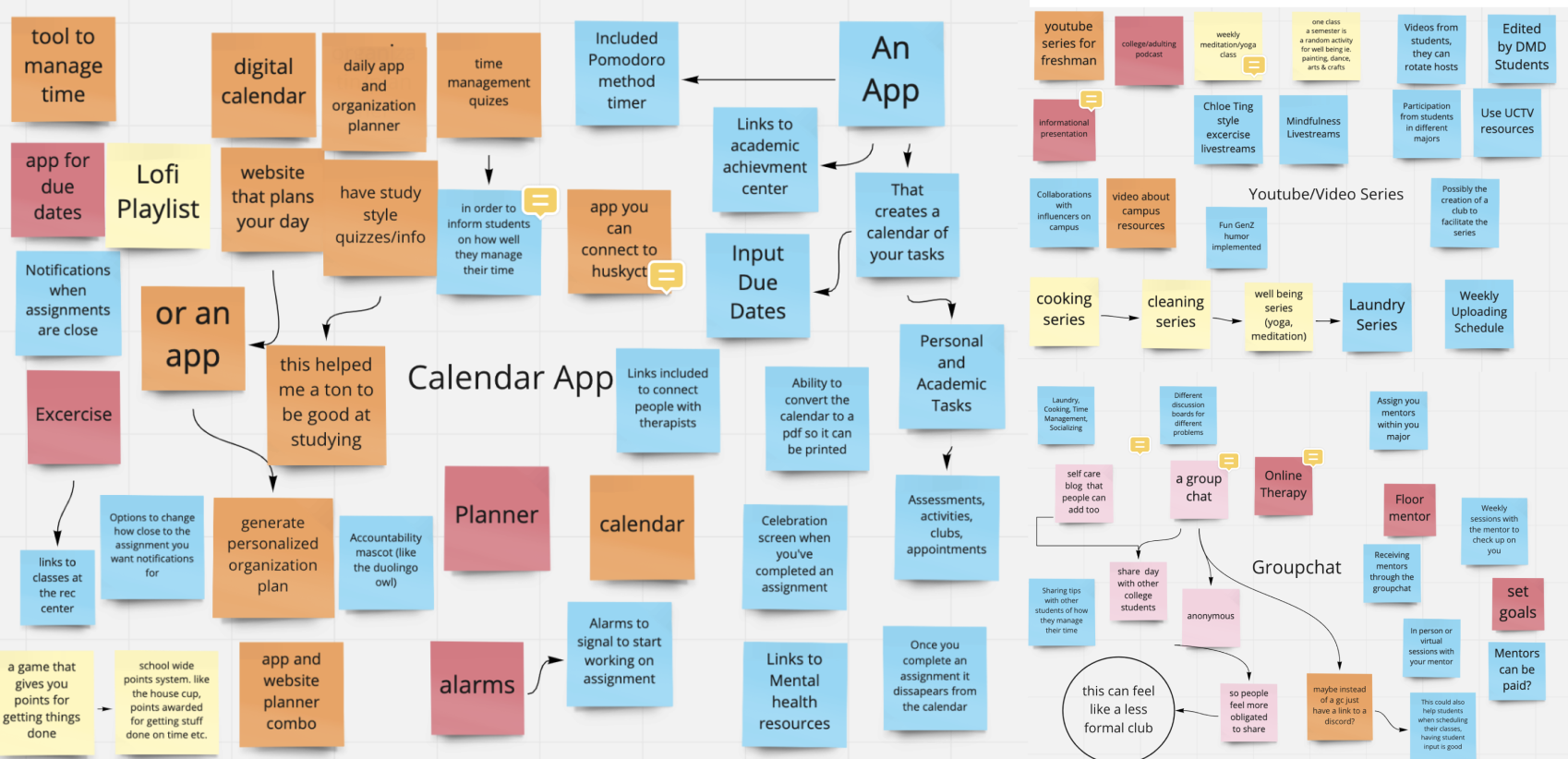
We used Miro, a web application to help us with our ideation stage. We worked together to come up with 3 different digital media tools to solve our problem

image of miro board used for ideating

Top 3 Ideas

1) YouTube Channel

The Youtube Channel would feature videos about time management that would be filmed by UConn Students

2) Group Chat

This Group Chat would act as an accountability partner and would include students that would allow students to set goals

3) Calendar App

This app would allow you to input your personal and academic assignments which would be featured in a calendar. Users would get notifications to hold them accountable for getting their assignments in on time. 

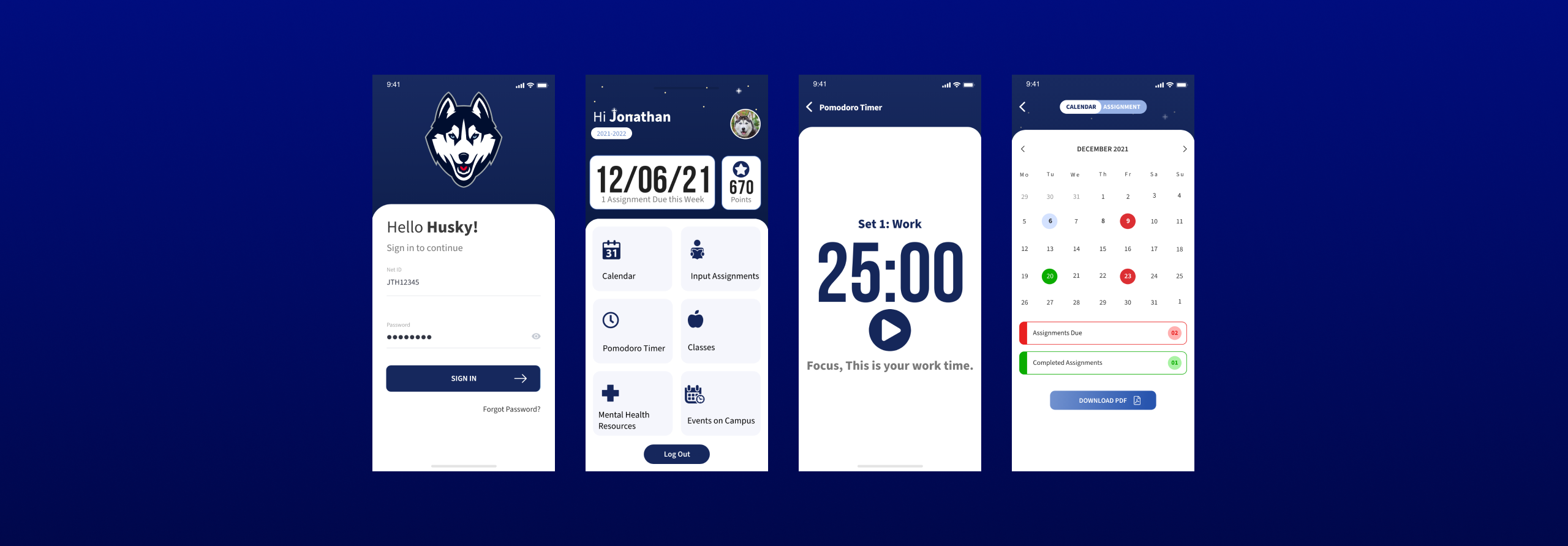
Original Screens for UCann App

First Iteration

These designs were the first iterations of the app that I created 2 years ago. I looked at this app and identified some pain points that I wanted to address with my new design. After working on this group project, I moved on and completed other projects. However, I wasn’t satisfied with how the project turned out and knew that I wanted to revisit it in the future. The first thing I wanted to do was assess some pain points of the app to give me a starting point to work off of.

Pain Points

  • There is no bottom navigation to easily switch between screens
  • The home screen buttons don’t come across as buttons
  • There is equal weighting between all the buttons on the first page, whereas the app should be more focused in keeping track of assignments rather than mental health resources
  • There is no consistency in border radius in the cards on the app.
  • There is little consistency in font weights, and the hierarchy is not well established

Competitive Analysis

I decided to look at competitors in the field to gain a better perspective on what other companies were doing right and wrong. The two apps I decided to research are Evernote and Any.do. I downloaded these apps onto my phone and took notes based on my experience. I found that these apps have features that are blocked behind a paywall and lack any recognition of mental health struggles.

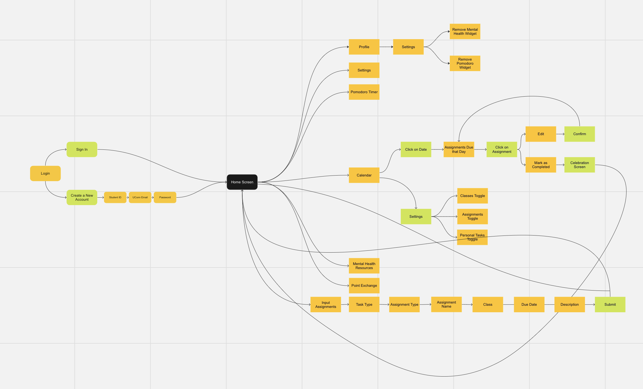
Information Architecture

I organized the app to be focused on the Task Input and Reward aspect because based on the survey students felt that they struggled with Time Management the most. I decided to make the Pomodoro Timer and the Mental Health Resources a widget that can be disabled because not all students struggle with their mental health.

User Personas

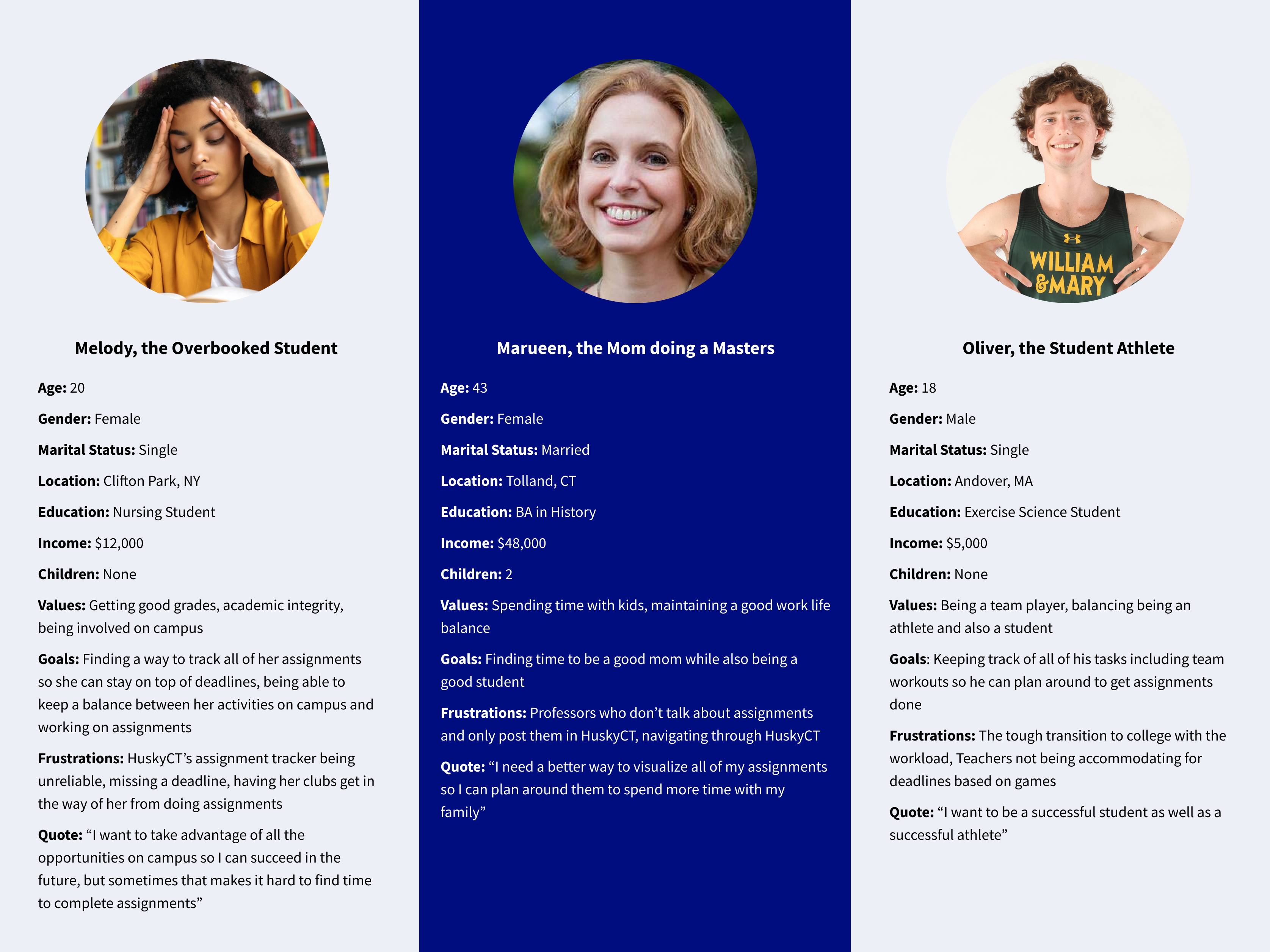
After analyzing the issues with the app, I decided to construct user personas to better understand our target demographic and their pain points. In my user personas, I wanted to represent a diverse set of students, because historically commuter students and older students are overlooked  

image of miro board used for ideating

Sketches

Wireframes

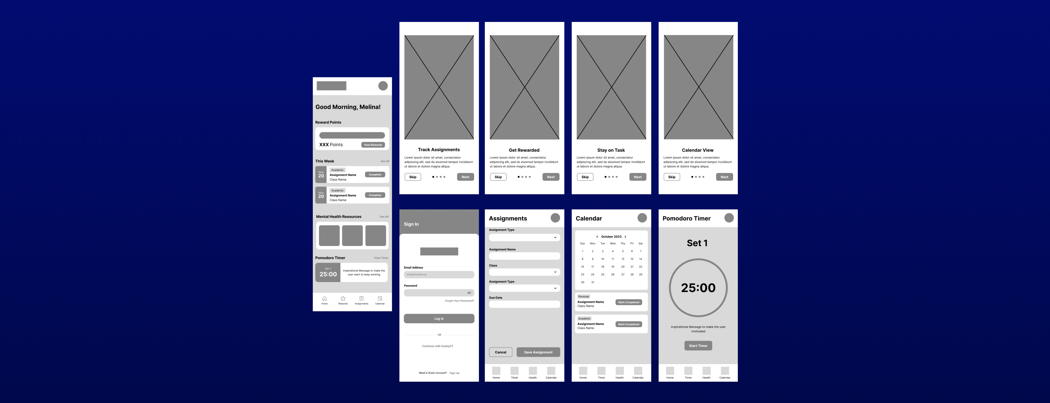
In my wireframes I wanted to establish the general layout of the app and the design of the cards that I use throughout the app. Overall I stayed true to this design, however there are some small tweaks I made including rounding the cards and changing the icons in the bottom navigation that I made along the way.

Progression

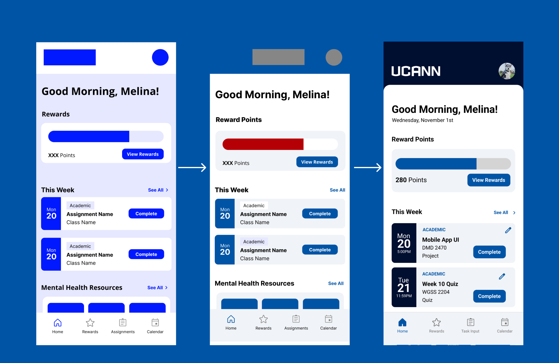
At first, I wanted to go for a single color app with variations of the opacity of the main color to create my color palette, however this left my app feeling a little flat, so I decided to change up the color scheme to replace the purple-blue to a more standard blue. At this point I added a red accent color, but it drew too much attention to the reward bar, so I decided to add a dark blue which corresponds with UConn’s branding. By the end of my designs I implemented a rounded border radius on the body of the app to add more visual interest to the app and I chose to fill in the bottom navigation icon to make it more clear for the user which screen they are on

image of progression of UCann App

Flat Designs

UCann Demo

Final Thoughts

This experience definitely taught me the value in conducting user research. In my first designs I created, I jumped straight into the design phase after conducting interviews, which made the app less usable. Once I started to implement user research, especially the user personas which allowed me to better understand my users goals, then my wireframes and designs improved. I think this app is a testament to the growth I have made as a UX designer, as I now have a new appreciation for the empathize stage of the design process.